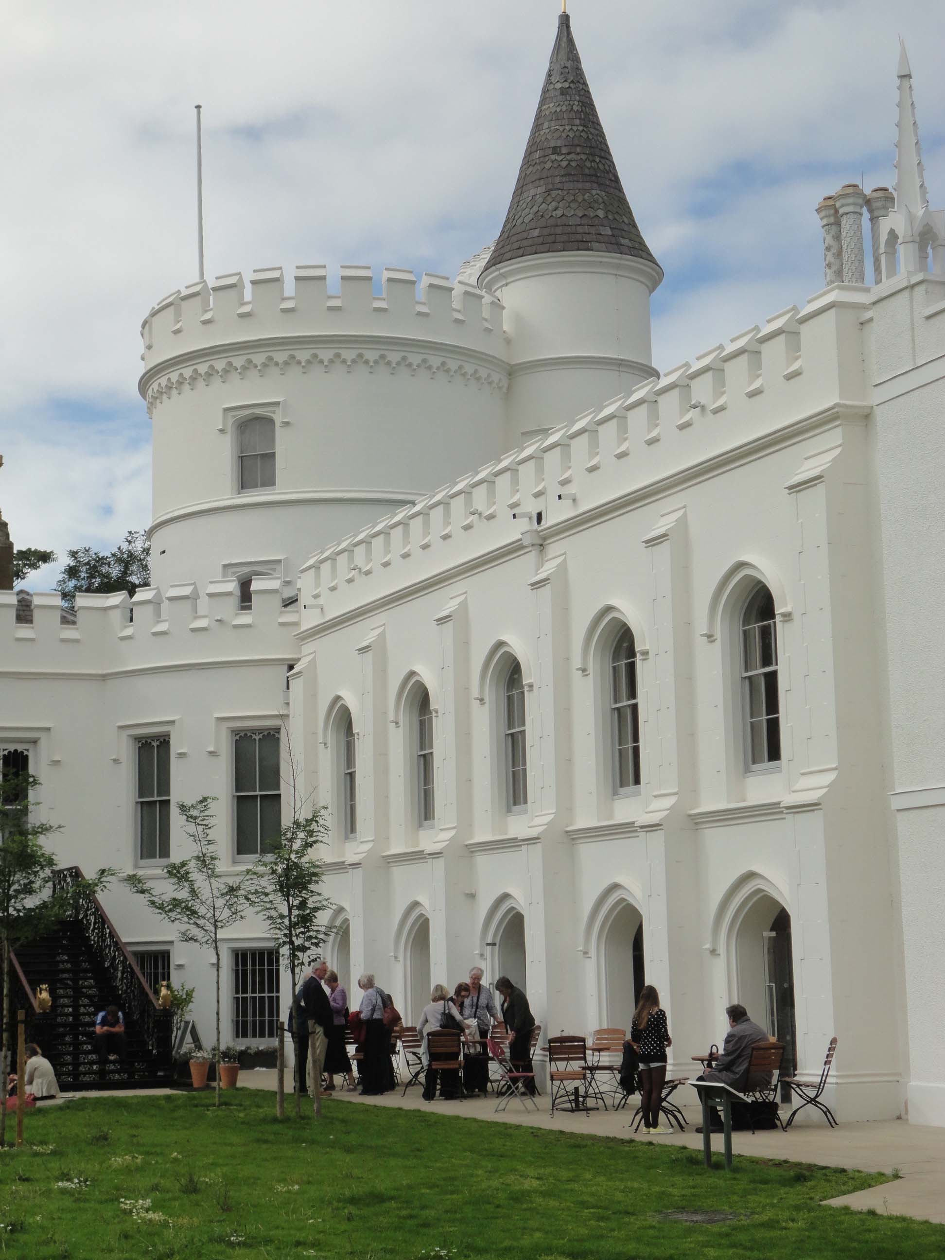
This week I visited Horace Walpole’s infamous gothic villa in Strawberry Hill and was quite unprepared for what I found. Not exactly Georgian interior design but well worth it!
Not generally a fan of the gothic style, except in churches, I was not expecting to find very much here that inspired me. Nevertheless, I felt it was a mandatory visit for anyone who is interested in architecture built in the late 1700’s.
First Impressions
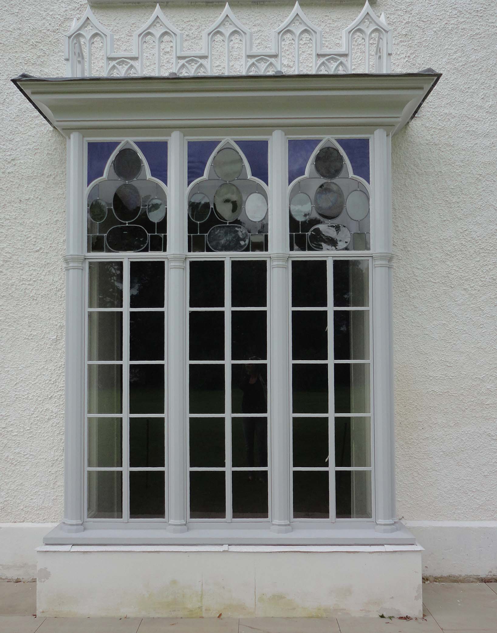
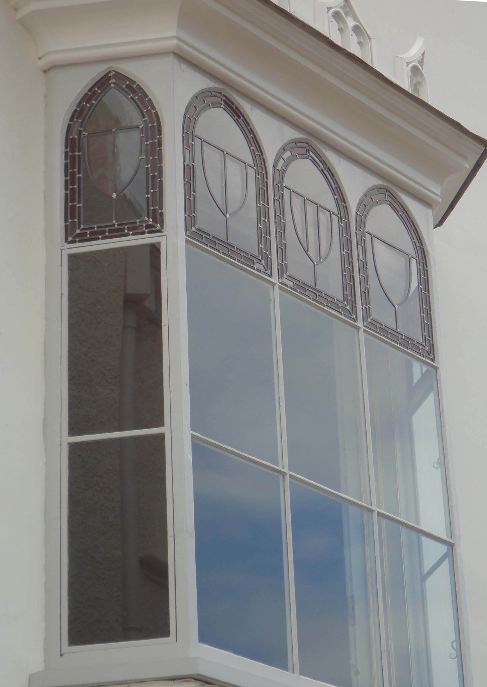
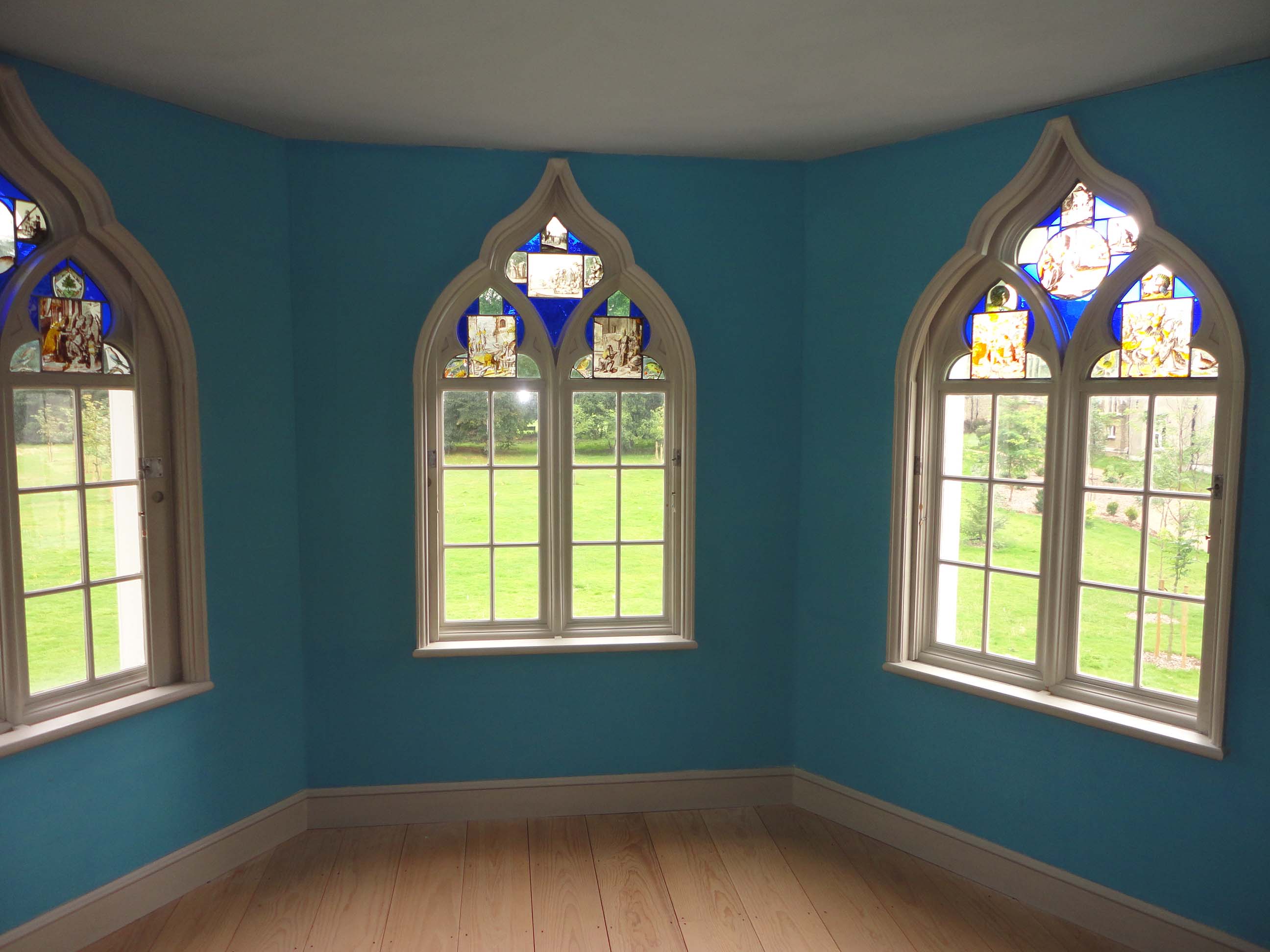
Not inspired – how wrong could I have been? Even before entering I was bowled over by the beauty and elegance of the building. In particular, the windows with their varying mix of clear glass and stained glass and the ornate and exotic chimney pots which for me are somehow reminiscent of the Brighton Pavilion.


Moody or Mood Enhancer?
Inside there’s so much to learn from the highly creative Walpole and the summer residence he designed. It’s often described as a theatrical experience and to an extent I would agree. I was there on a bright and sunny day and didn’t experience much of the ‘gloomth’ – gloom and warmth – which Walpole talked of creating. However, what I noticed was an interior design that cleverly dictated the mood as you walked through the different hallways and various rooms – often taking you from one wildly different atmosphere to another.
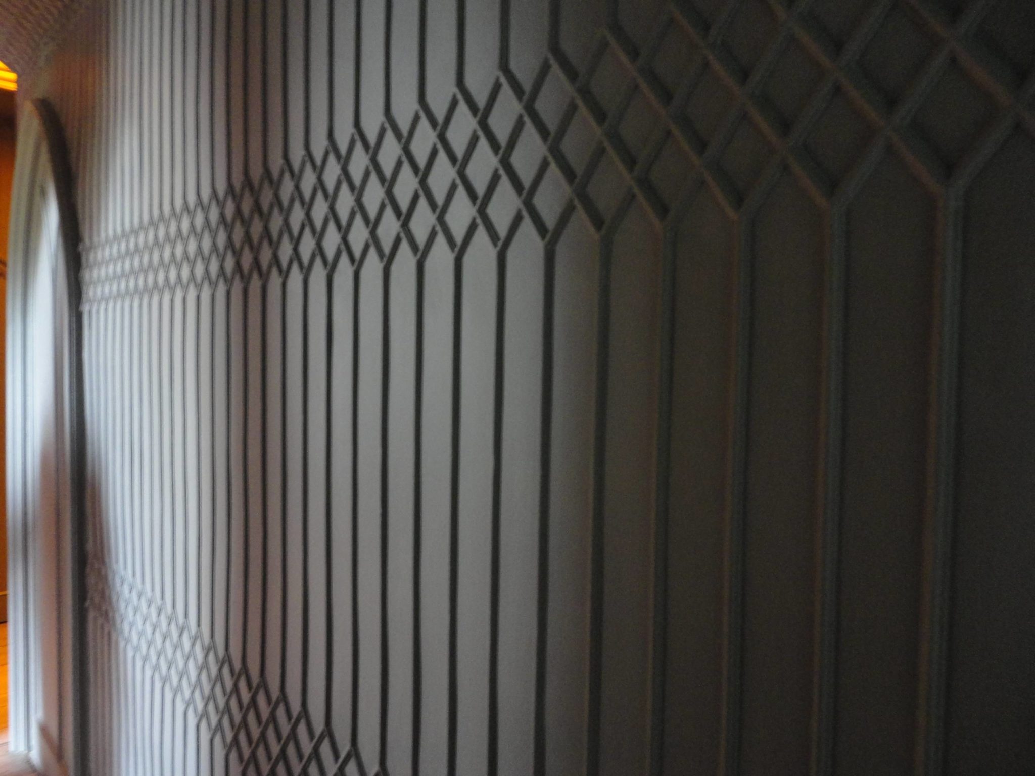
For example, the magnificent first floor passageway called the Trunk Ciel’d Passage which is just off the Holbien Chamber on the first floor reminds me of an uber-cool nightclub – with tracery along the walls that whilst based on a gothic pattern could equally be a contemporary effect. Walpole situated a skylight of orange glass at the end of the passageway to flood it with a deeply warm yet supernatural atmosphere. In the days before electric light this must have been fantastical.
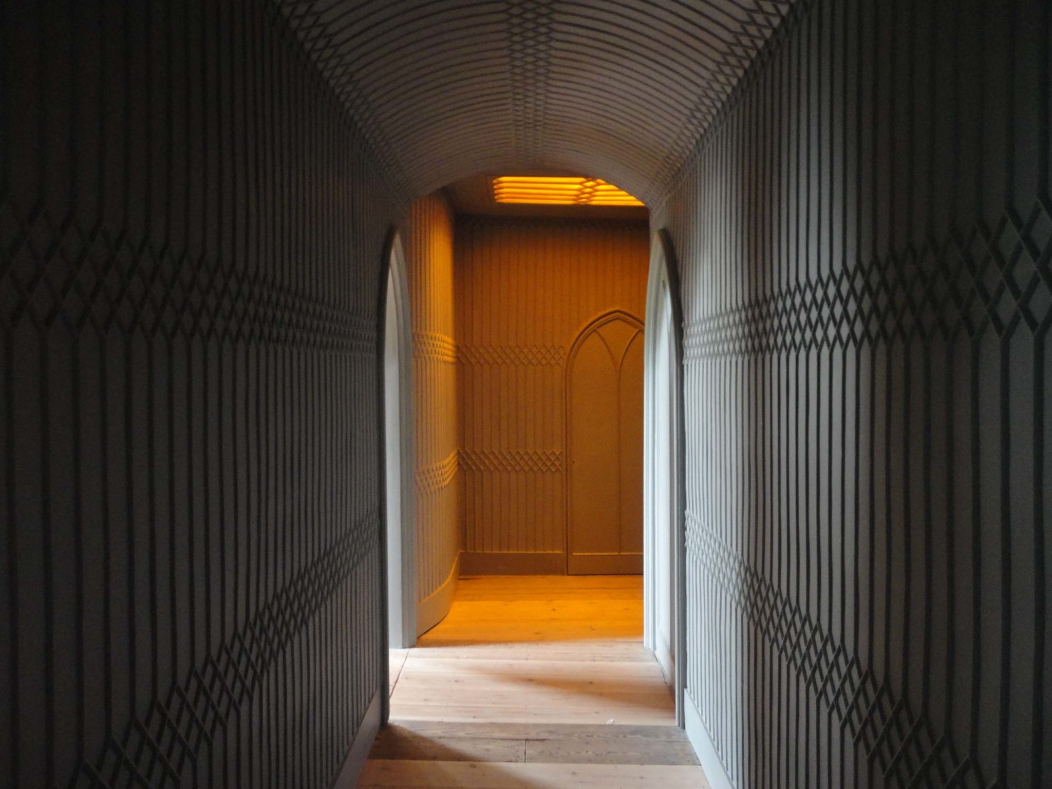
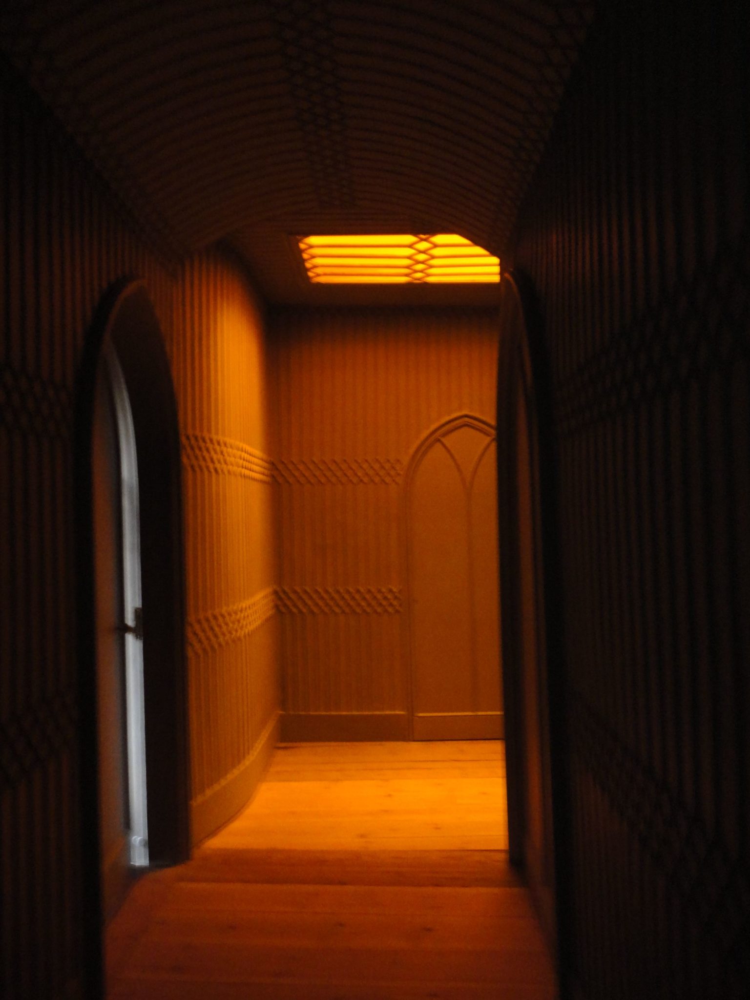
From here you open the door to the Gallery and are confronted with a burst of light and colour that’s so vivid and magnificent that it takes your breath away. What a way to get the attention of your visitors for your art collection.
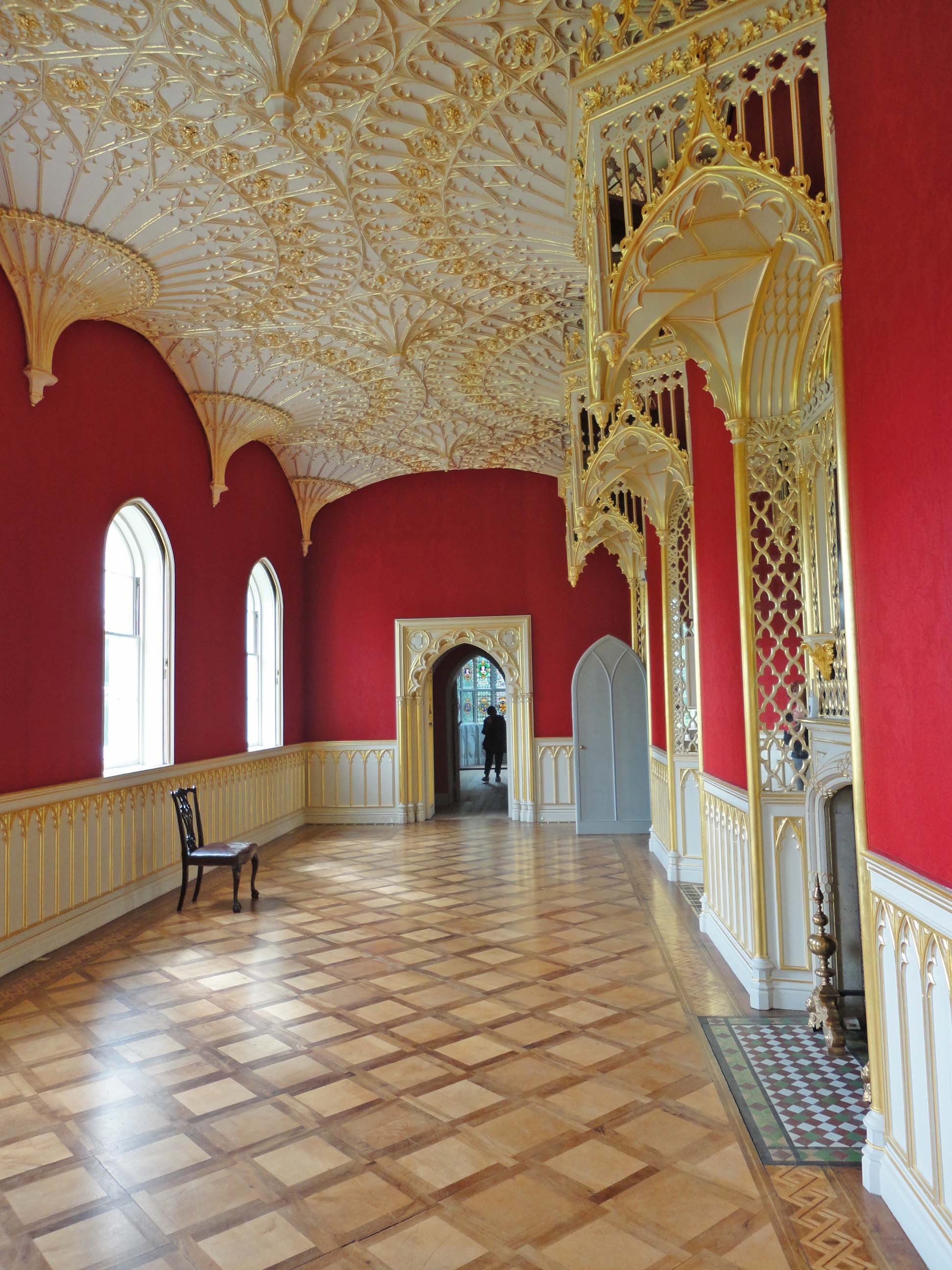
The importance of Colour
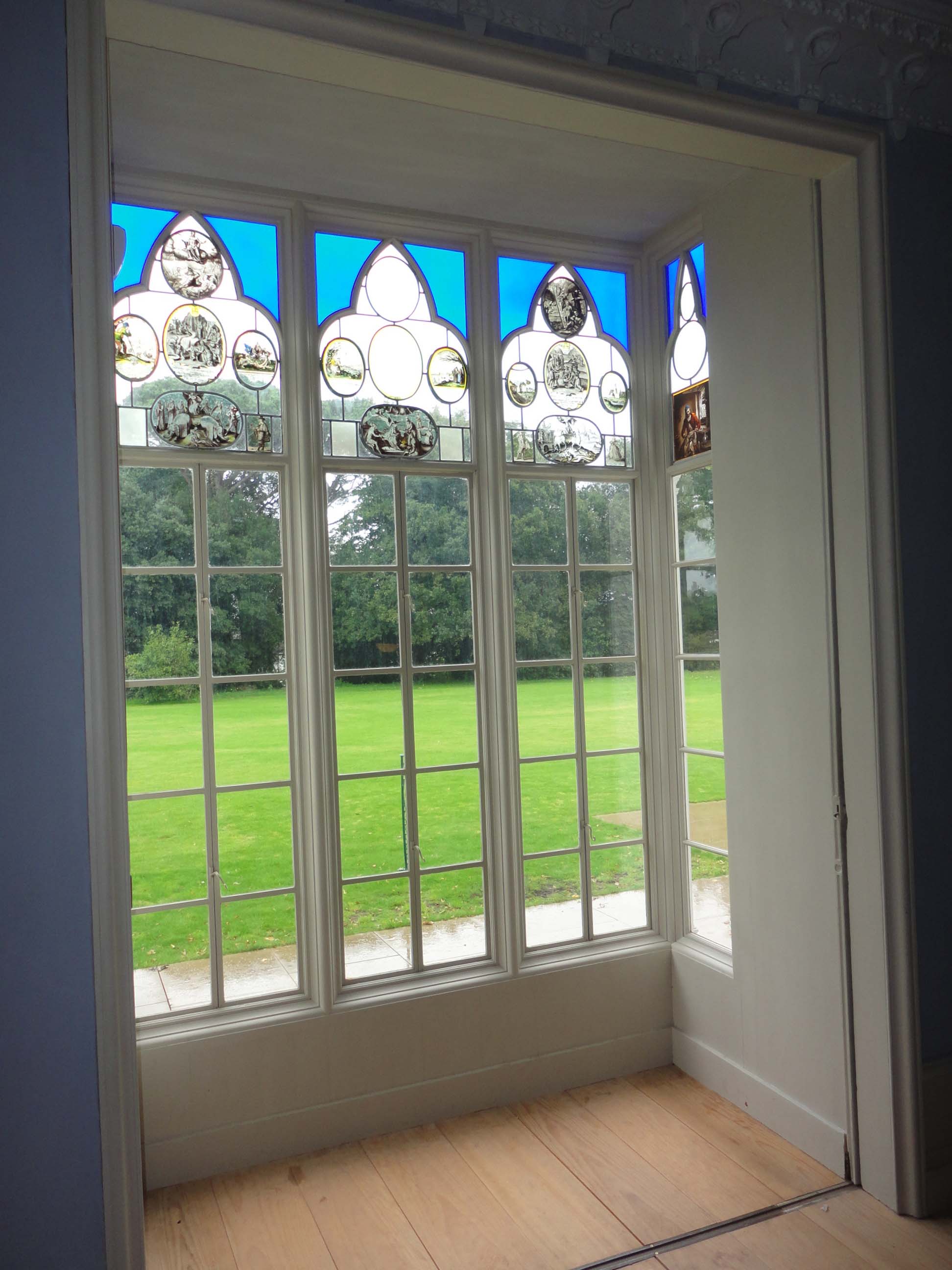
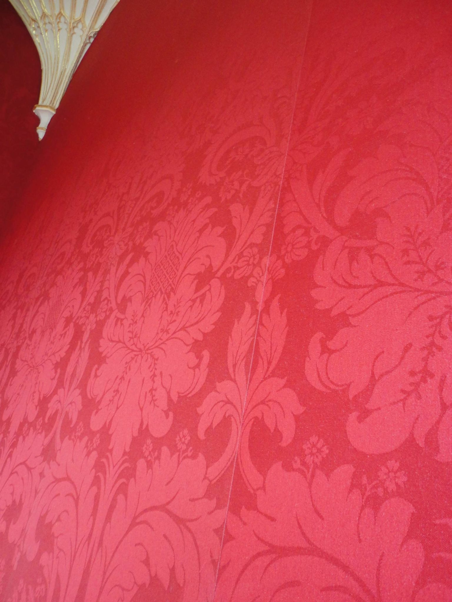
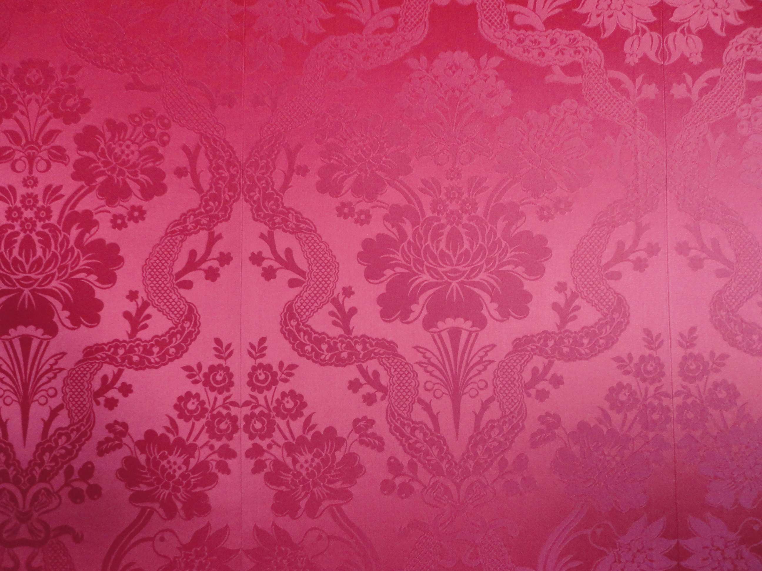
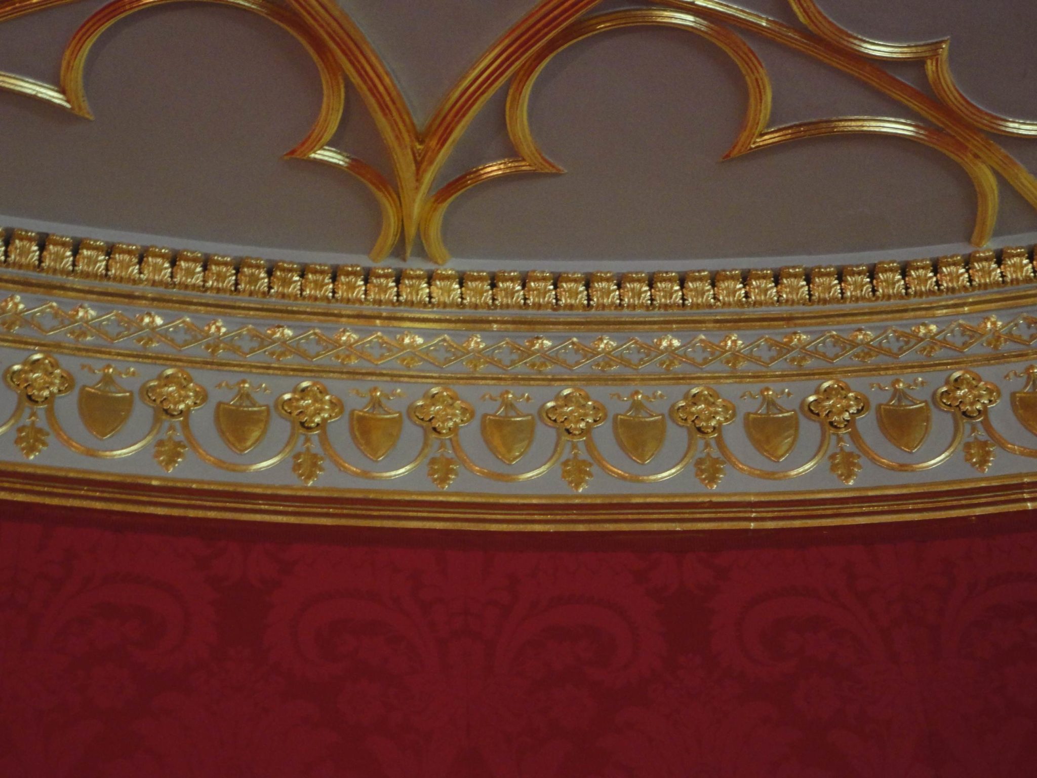
I love the intense red of the wool wallcovering, which is stretched across wooden batons. The intricate gilding in the room against the sparkling white and vivid red is, for me, the most spectacular combination of colours if you’re looking to make a statement. The five well proportioned windows, that run along the south wall of this space, provide an abundance of natural light and in the gallery, unlike most of the other rooms, there is no stained glass to complicate the light that would have illuminated Walpole’s works of art.
This is indeed something we can take into room designs and schemes that we create for today’s homes. I’m not much of a believer in neutrals throughout or ‘pale and interesting’. I think each room has a different purpose in a house and the atmosphere created by the décor, light and furnishings should be conducive to that.
The gallery is not the only room to use colour to great effect. I loved the choice of colours in all of the rooms and was surprised to find so much of it and such variation, all of which would work well in todays interiors.
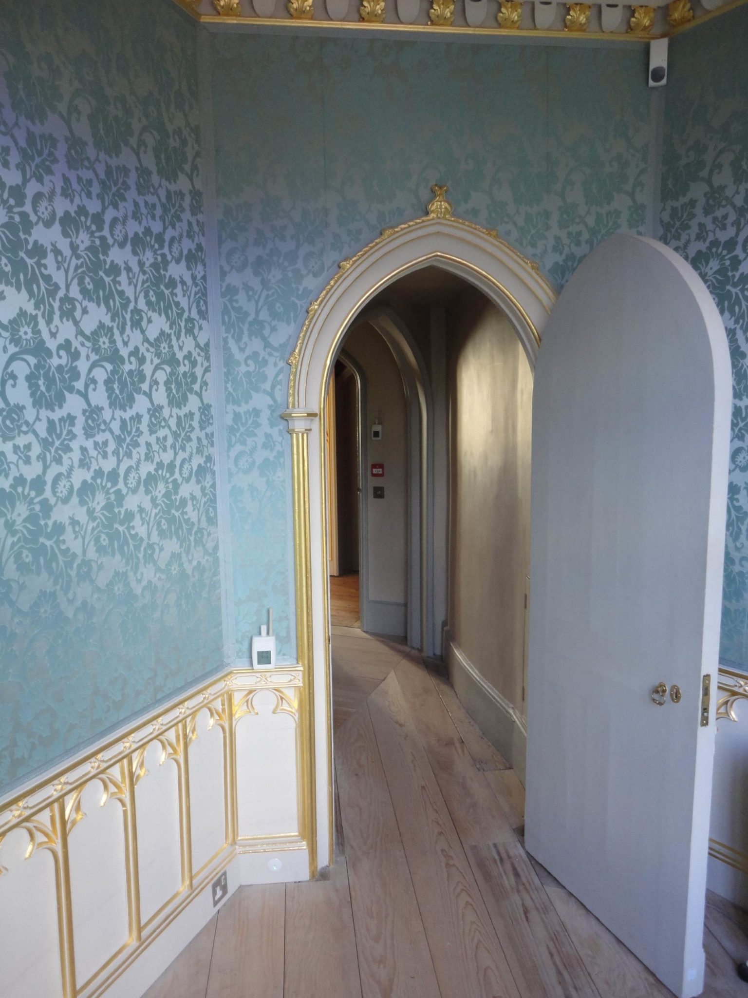
What is also of note is the way in which you transition through the house – you are taken on a harmonious journey. Nothing grates or clashes and as any designer knows this is one of the most important principles of interior design
And to complement these colours there is good use made of mirrors throughout the house to enhance the effects of candles dancing after dark.
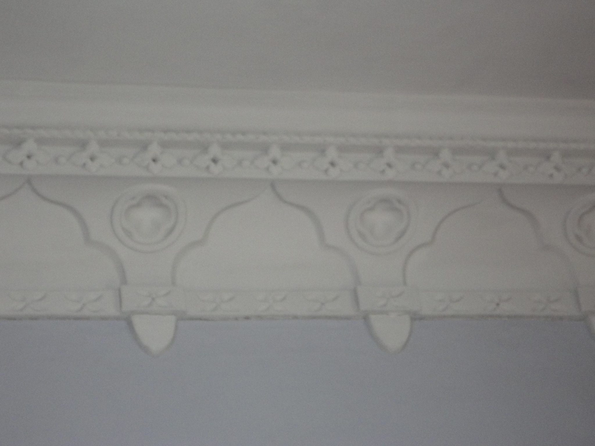
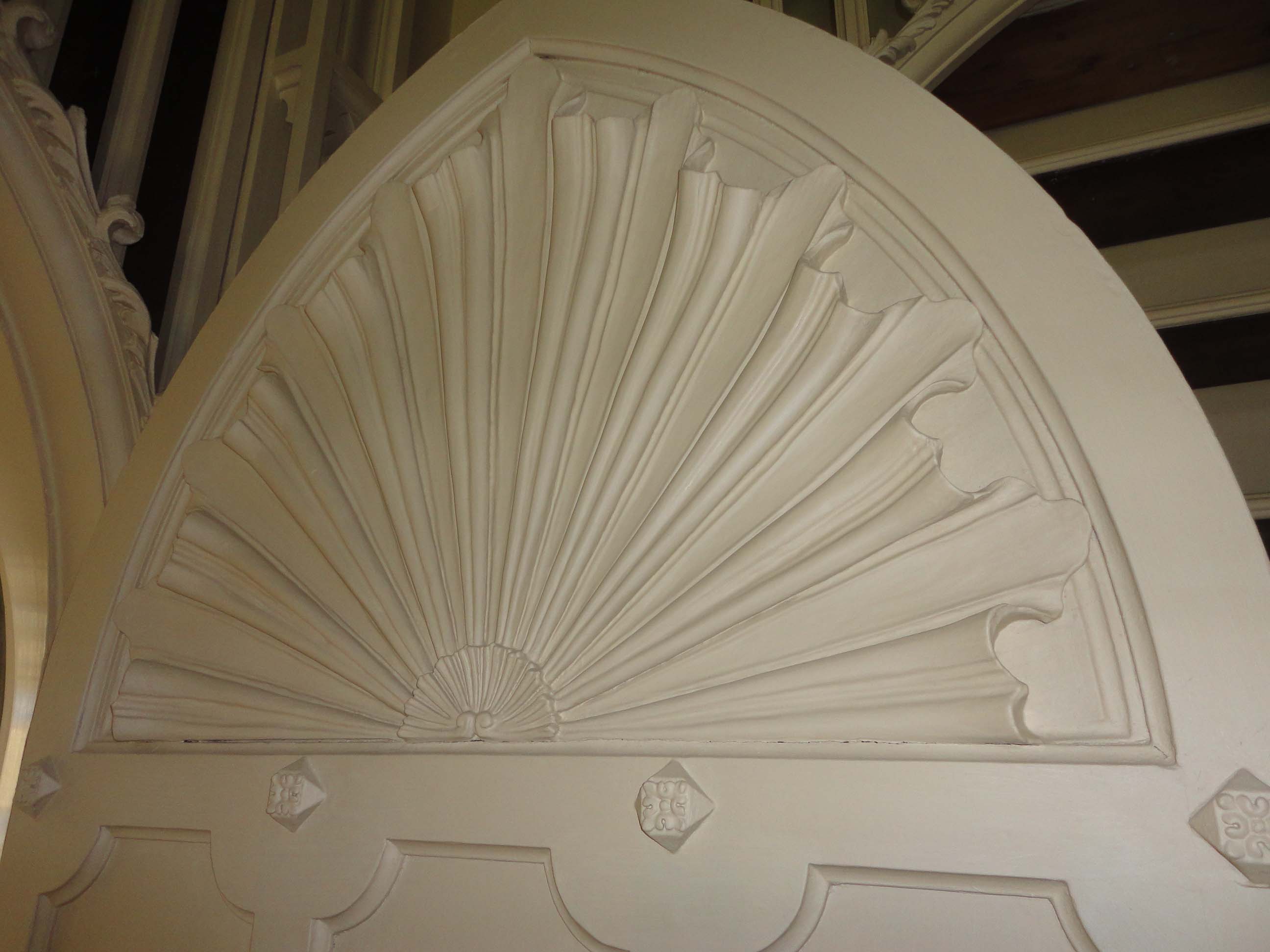
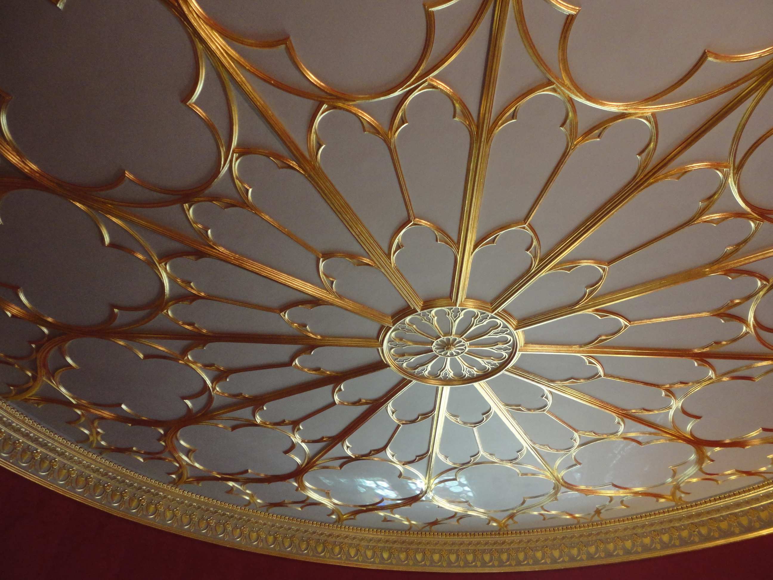
Other details, that I was simply delighted by, were the cornice and friezes around the various ceilings. They may well have monastic or religious influences but I found them to be delicate, attractive and even what I would describe as ‘pretty’ which I’d never have associated with the Gothic style.
In the main room of a grand enough house today these would look spectacular.
The gallery floor, shown in the main Gallery photo above, was also interesting. It was installed in 1856 under Walpole’s surviving niece, Lade Waldegrave. It’s warm hues of caramel that come from the natural tones of oak and maple provide a wonderful juxtaposition with the highly ornate and artificial feel of the ceiling. Such a floor would work so well in many Regency or Georgian style interiors of today.
An element of this house which is very in keeping with current trends are the Moorish design of the mirrors in the gallery. Whilst I prefer to use this kind of style in holiday villas rather than in the UK it is nevertheless a great example of how the Moorish influence has inspired us through centuries of design and continues to do so.

- Mirrors used to great effect

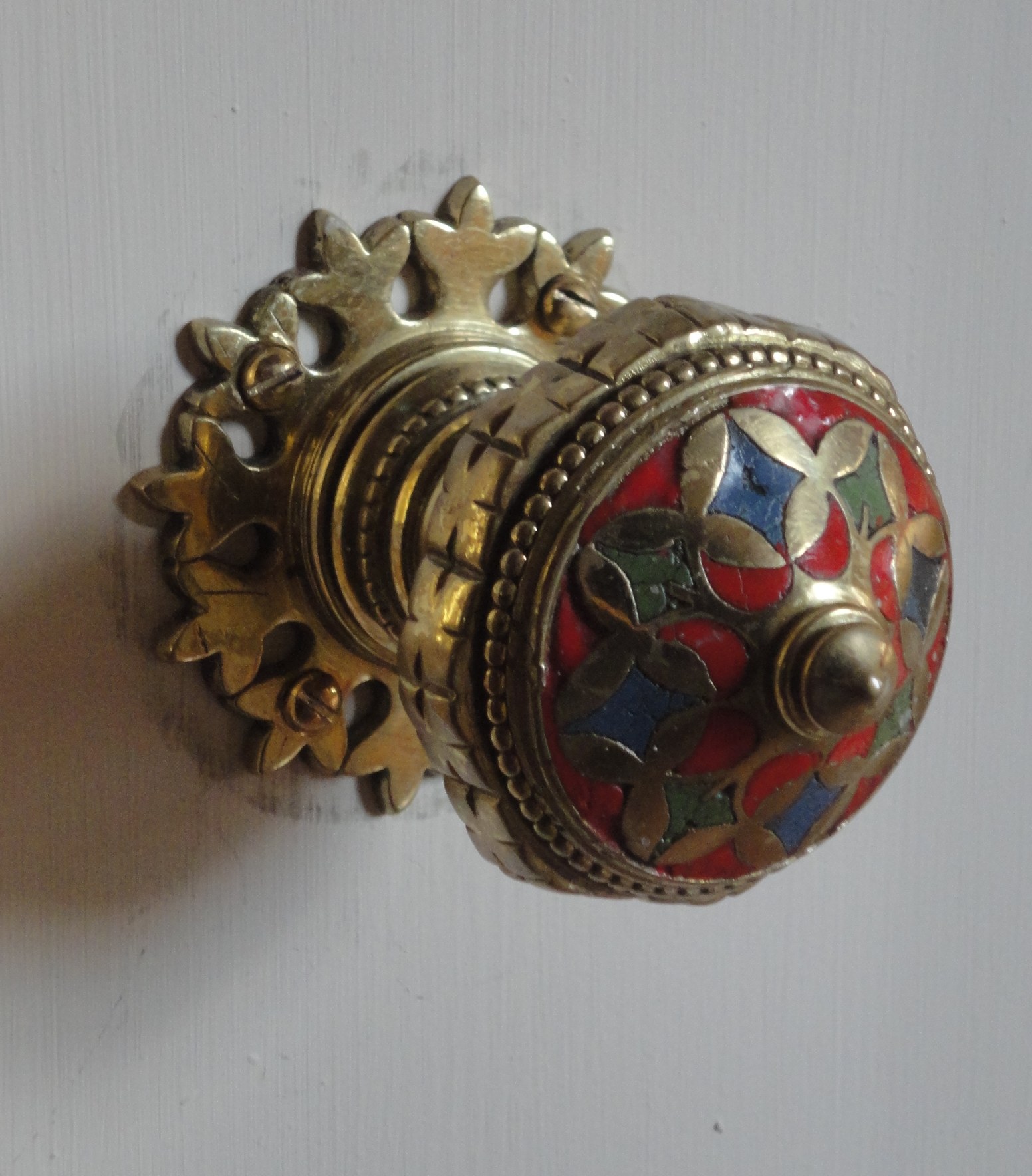
The doors and the door furniture throughout the house were all very much part of the intricate design, and many of the visitors that were at the house when I visited commented on these elements of the design. It’s so important to pay attention to details like this when renovating a house, whether you wish to be faithful to the date and style of the house or you want to have some fun with high quality contemporary designs. There are so many great ranges on the market to choose from and in my opinion this is one of the finer details that’s really worth spending time and money on.
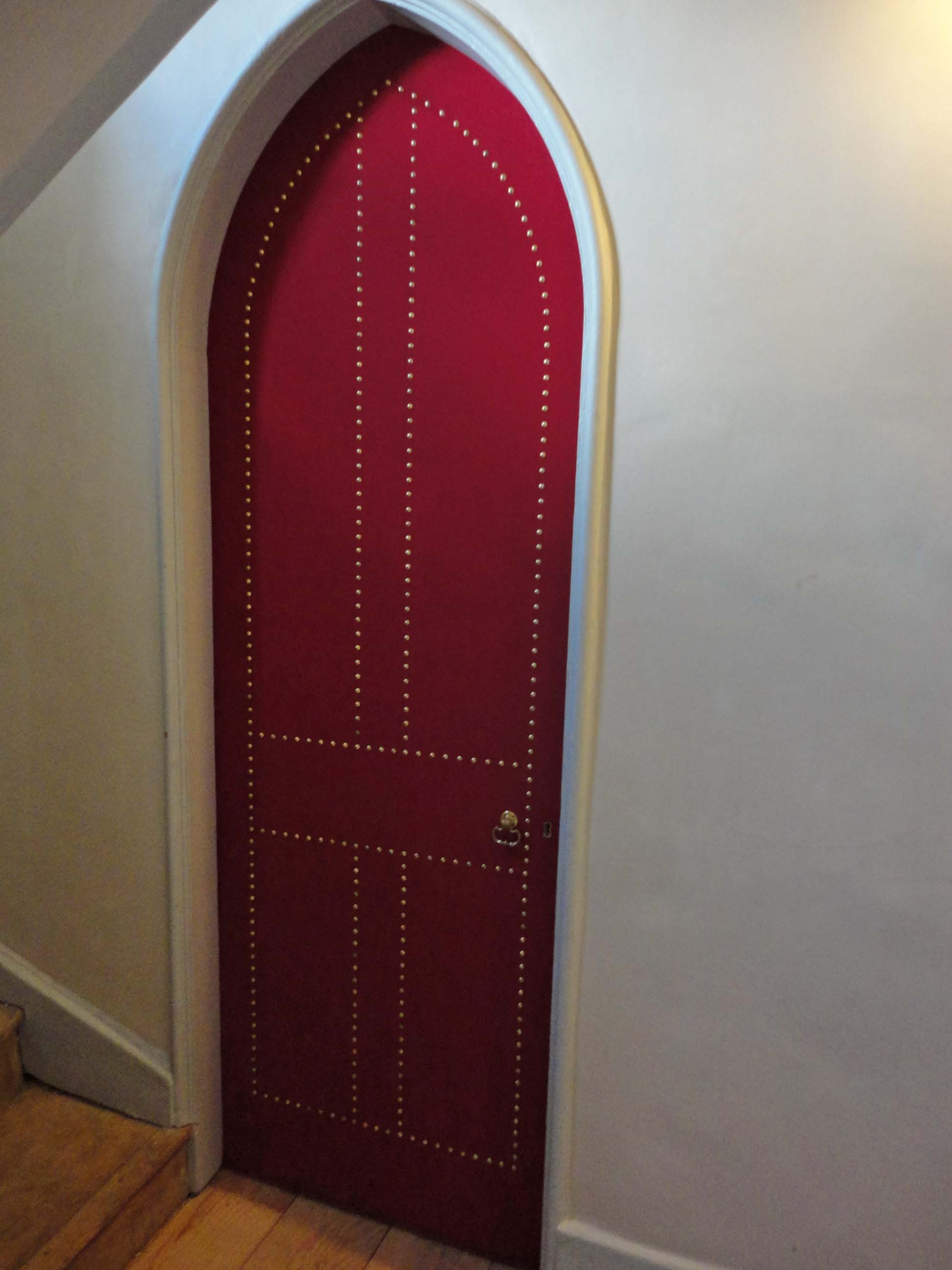
Another design element that was consistent throughout was the innovative, and most unusual detail of the interior window shutters. These were all designed to slide into the fabric of the walls or behind wall-paneling, where it existed. I have never seen this before but what a great idea particularly for occasions where you don’t want shutters to take up space at the sides of a window or to detract from the design of the window.
The Round Room and The Tribune
The other rooms of specific note for me were the Round Room designed by Robert Adam and The Tribune.
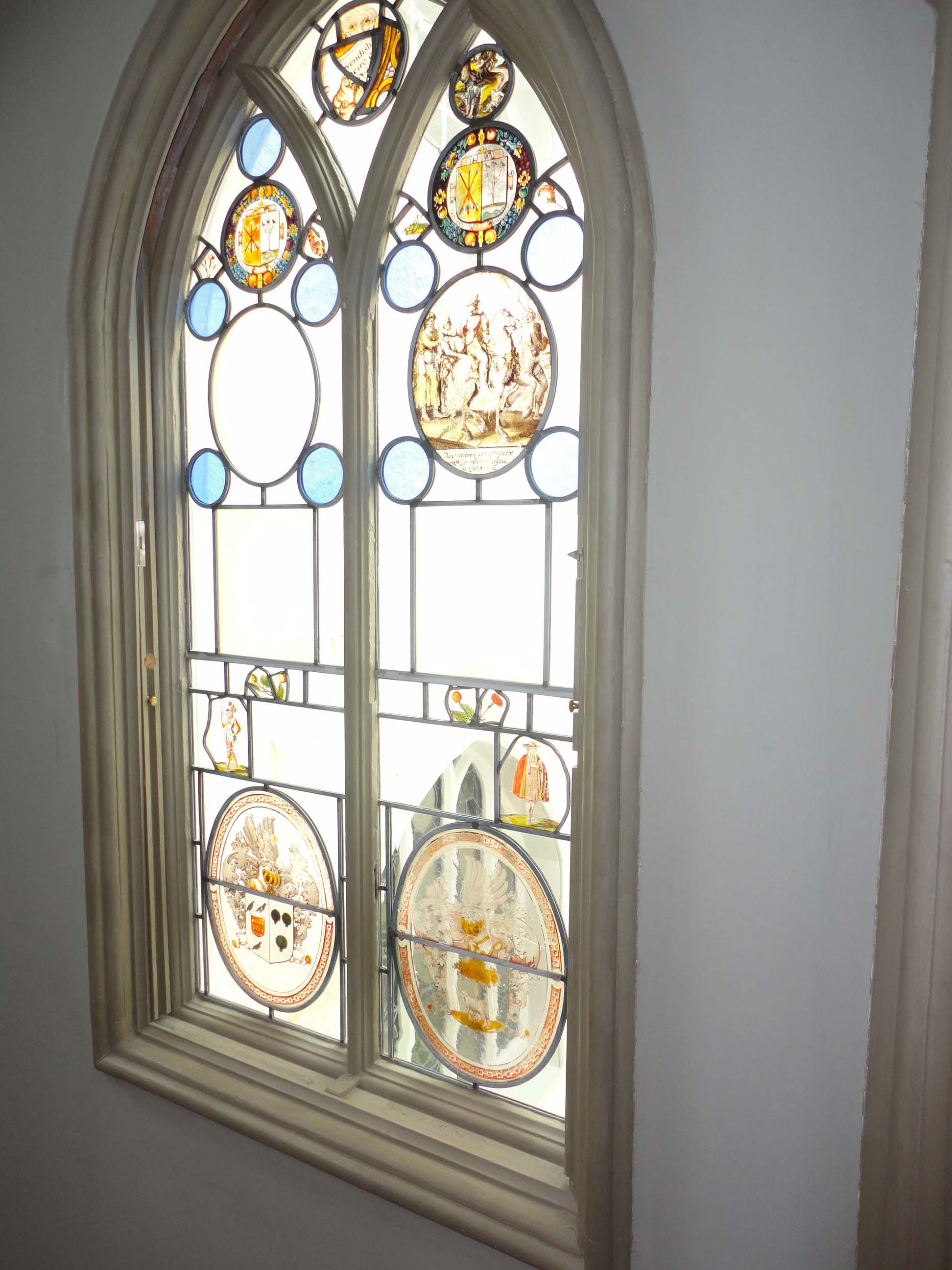
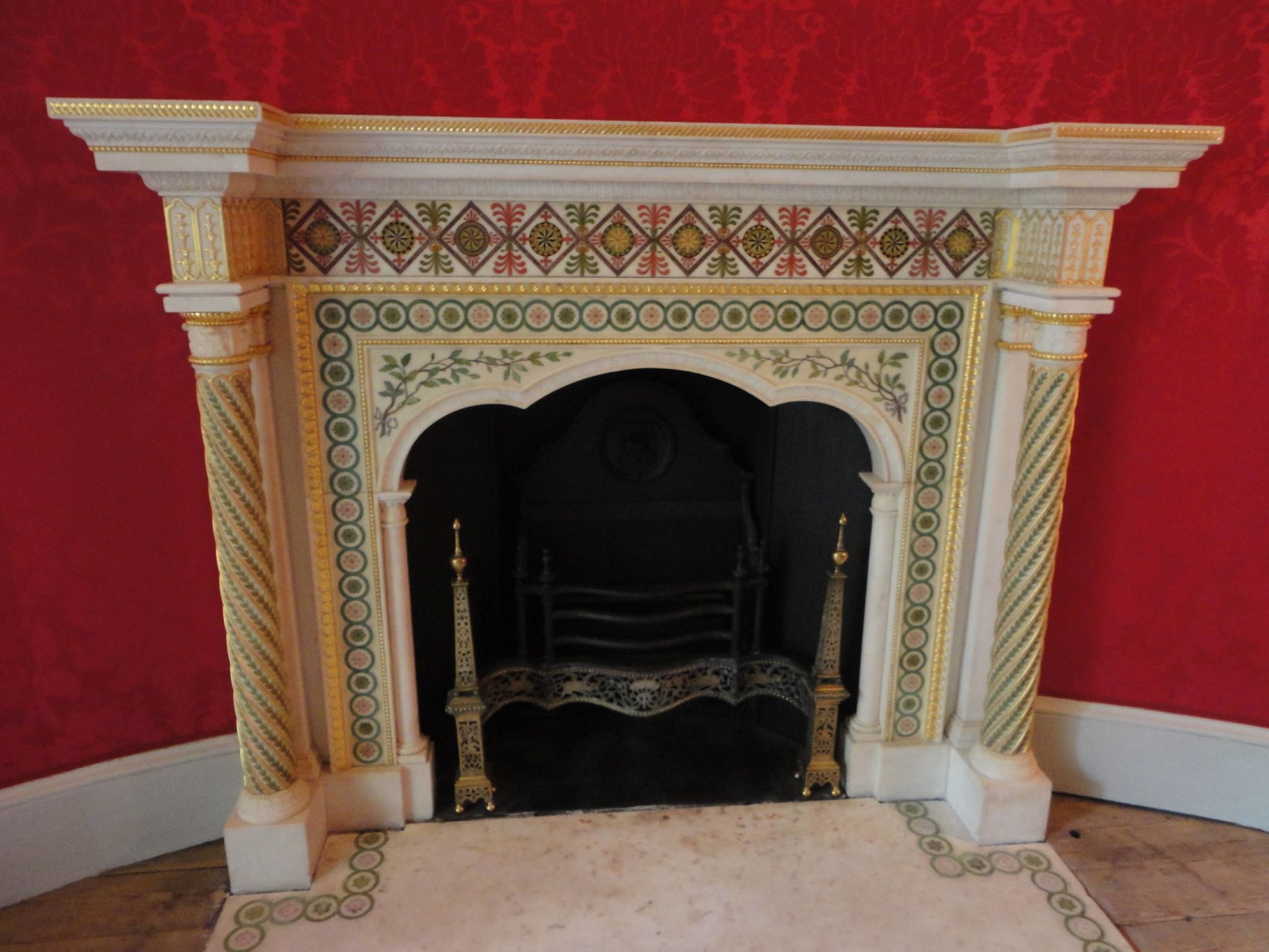
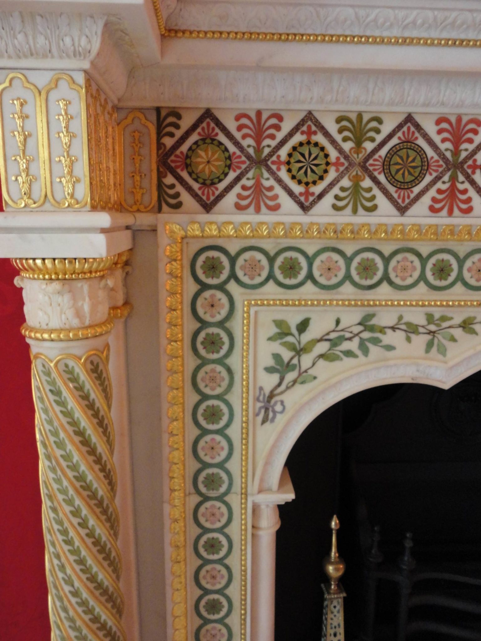
The Round Room is situated through a door at the far end of The Gallery and it continues the same colour scheme. The wall covering is crimson Norwich damask. The glass, with its rich display of coats of arms, dates from the 19th century, one of the additions made by Lady Waldegrave and in my opinion, this window lacks the delicate balance that so many others do between stained and clear glass. The influence of Adam is most keenly felt in the frieze, shown earlier, and the fireplace design, the basis of which was taken from the tomb of Edward the Confessor in Westminster Abbey but then improved by Adam.

The room was used by Walpole to entertain visitors and in particular Royalty, statesmen and foreign dignitaries. You can imagine his visitors felt suitably enveloped in elegance and luxury.
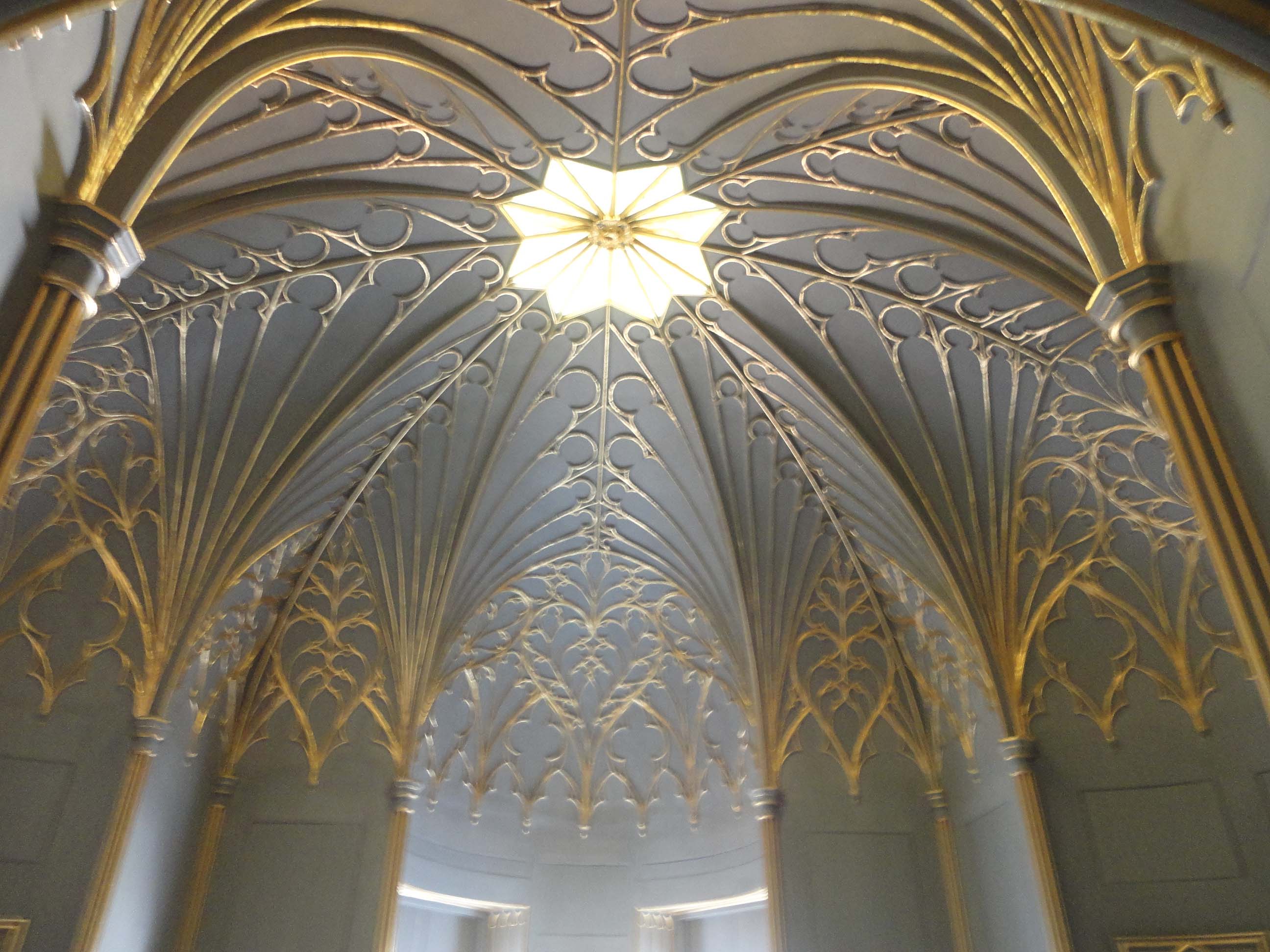
The Tribune, whilst also ornate, has a totally different feel to it. Painted a stone colour of which Farrow and Ball would be proud, with gilt ornaments, it is topped by a translucent star at the height of the ceiling that throws a soft golden light all over the room – again the effect is described as ‘gloom’ but I beg to differ. Its design is meant to convey the feel of a chapel but to me it’s more a sense of magic and enchantment. The use of coloured glass has diminished greatly in todays interiors however, it has reminded me just how effective a technique it can be in creating an atmosphere in a room, particularly one that requires such drama. This room was Walpole’s ‘treasure house’ in which he kept and displayed some of his most valuable possessions. There is even a ‘grated’ door, as in a bank vault, that visitors were allowed to peer through; only the most favoured being allowed to enter.
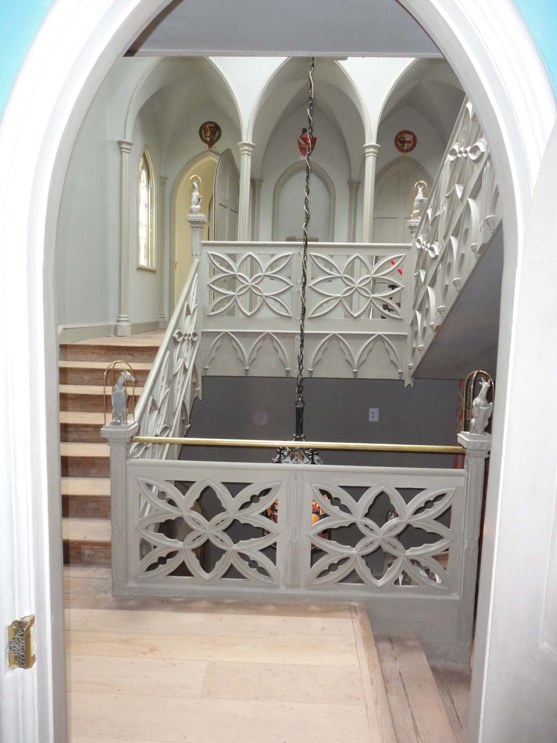
The Central Stairway
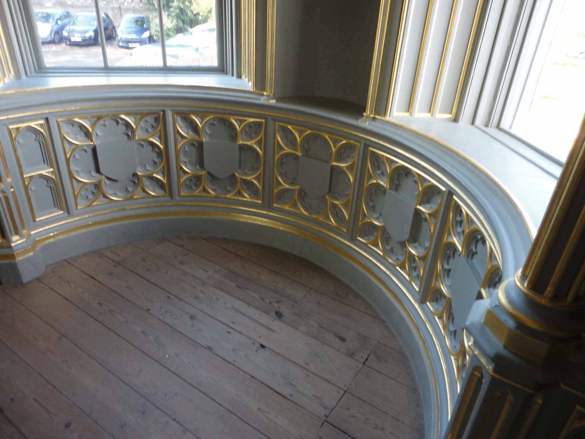
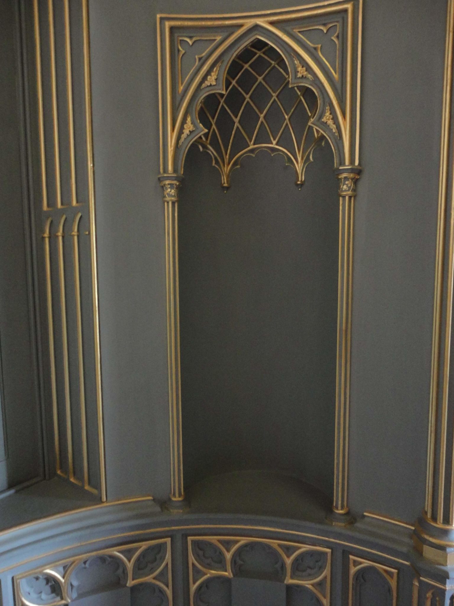
Finally, the stairway and atrium-like effect created by the windows in the ceiling were quite unlike anything I have ever seen before. Particularly, since the purposeful design means that the ground floor entrance hall, at the foot of the stairs, is a truly gloomy experience. However, as you rise to the top of the house you are greeted by more and more daylight. I’m not a fan of the gloom at the foot of the stairs but the use of the skylights, as was also a key design component in Sir John Soane’s house (if you’re interested in this please read my earlier post) is extremely appealing. Even though we nowadays have the benefit of electric light and all the effects that can bring, there is no substitute for maximizing natural light in the centre of a house.
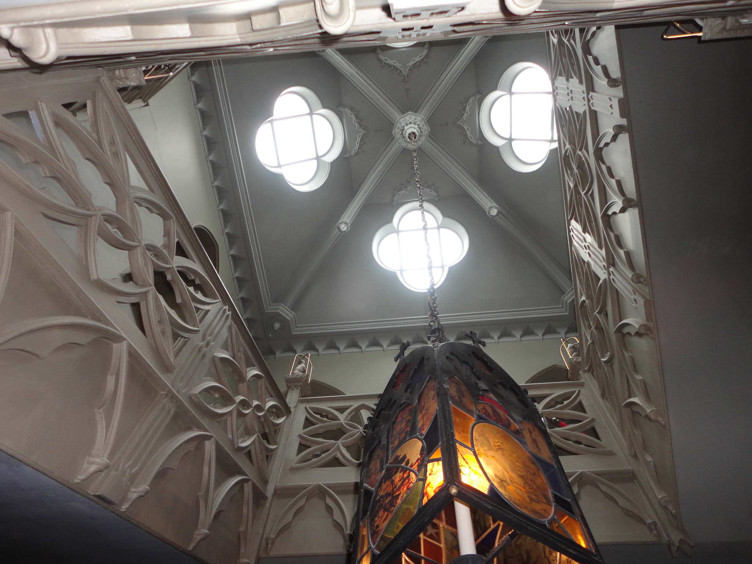
The design of the wooden staircase and balustrade structure is something quite spectacular and a wonderful sight to look out upon from the first floor rooms.
So what can we take from it all?
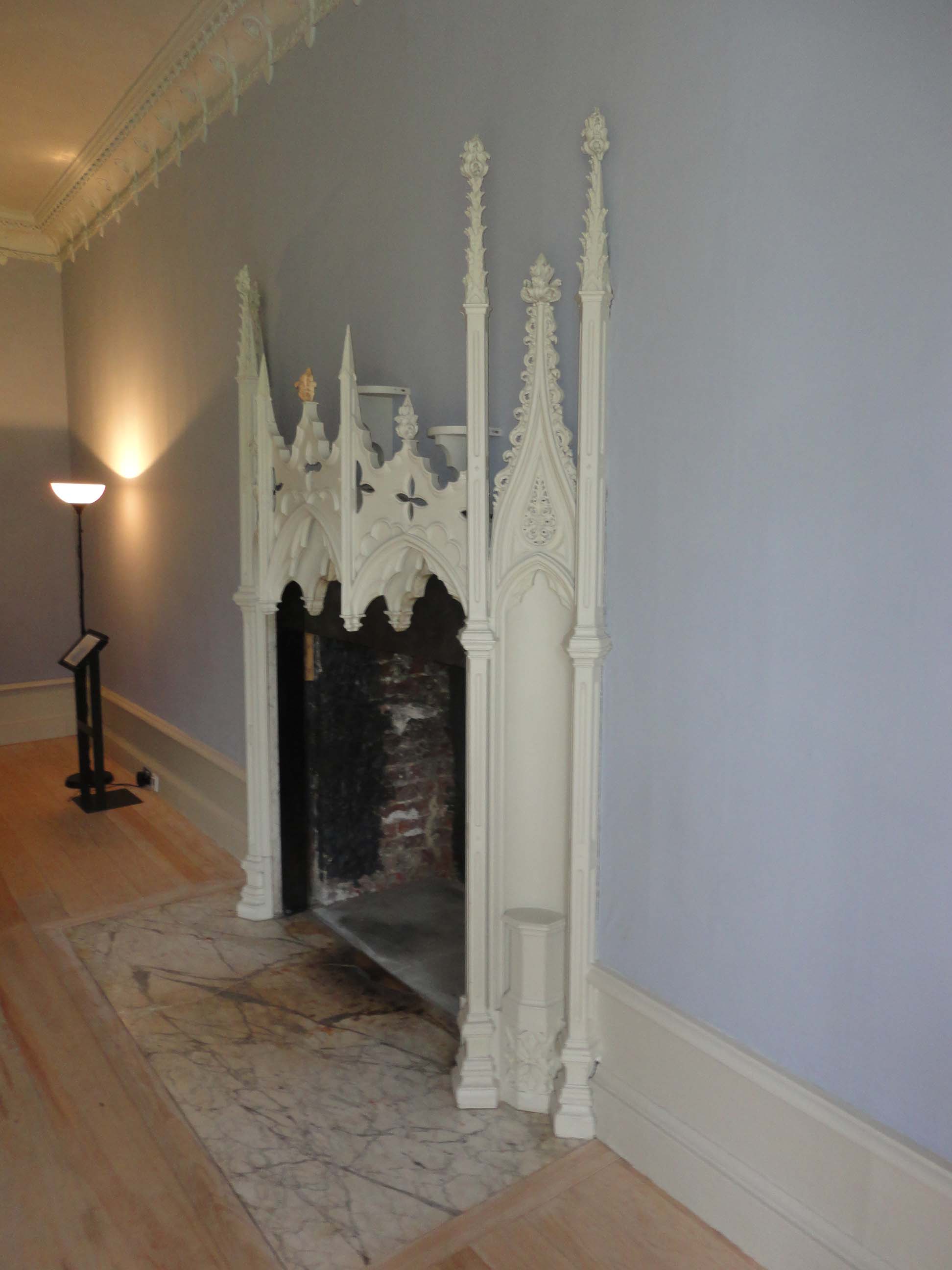
There were elements in the house that did not appeal to me, for example many of the fireplaces were totally over-the-top and far too ornate and gothic for my taste. The library and its bookcases were also too Gothic for me and Walpole may have been disappointed by my low levels of ‘gloomth’ detection.
However, there are some key principles that I feel we can take away from this magnificent house for use in the interiors of Georgian and Regency houses today. In summary these are;
- The theatrical and atmospheric effects of light and colour
- The harmony of colours whilst still achieving contrast
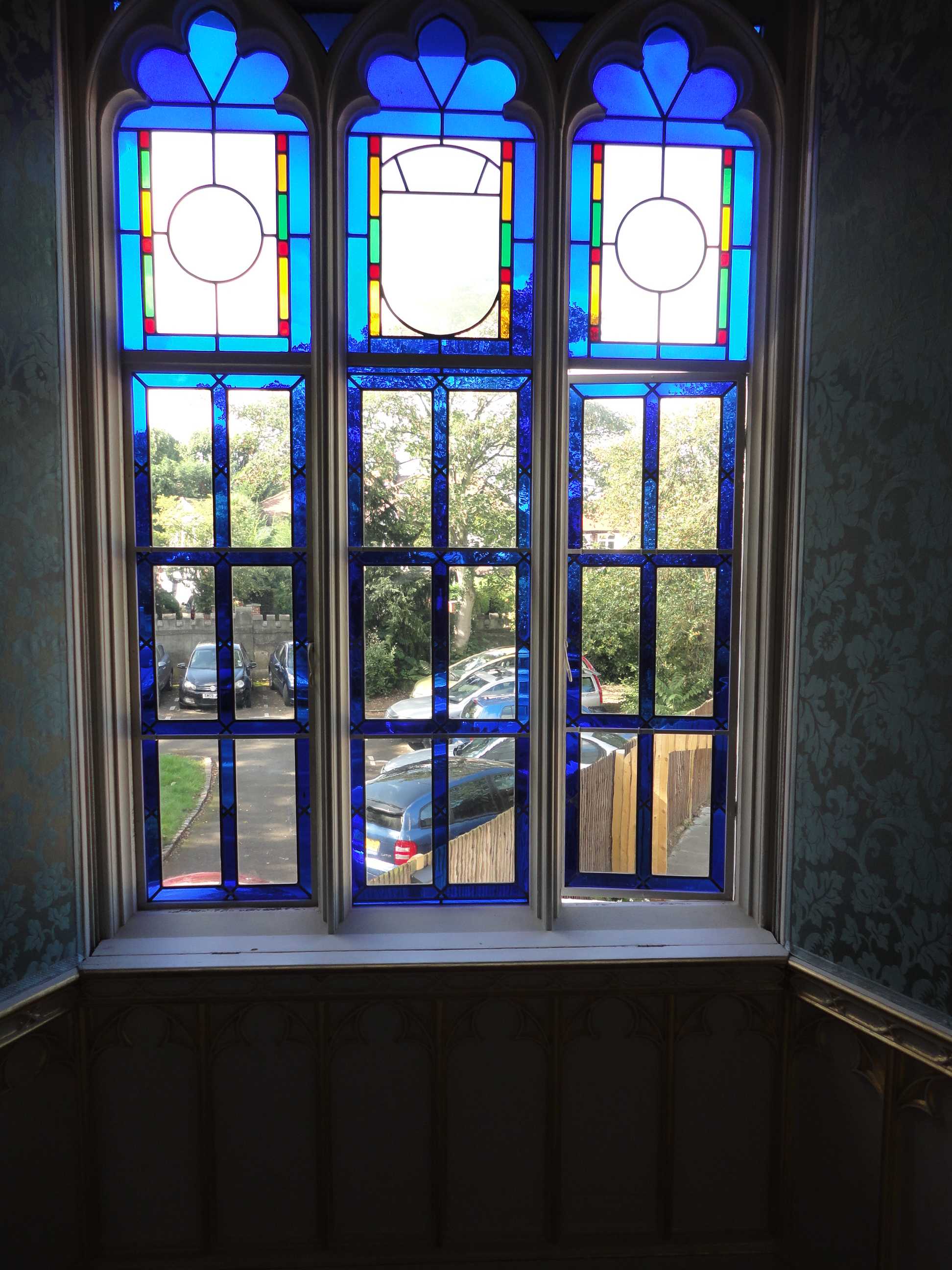
- The use of stained glass, either singular colour or multiple coloured designs balanced with clear glass
- The use of wool and silk wall-coverings
- Stunning cornice and frieze designs
- Sliding shutters that are built to disappear into the fabric of the walls
- Moorish influence
- The importance of proportion
- The effective use of door furniture in your design
- The imaginative use of mirrors
You can book a visit to Strawberry Hill House online at http://www.strawberryhillhouse.org.uk/book.php